Label Making
Creating two opposite aesthetic labels for hot sauce bottles.
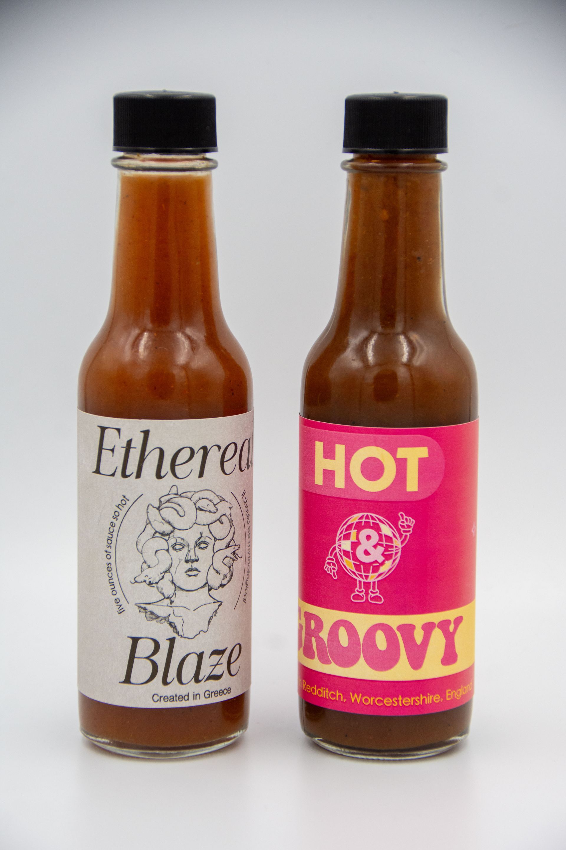


Ethereal Blaze + Hot & Groovy
This project explores contrast and duality through the design of two opposing hot sauce labels, each embodying a distinct aesthetic and conceptual tone. One leans refined and mythic, drawing on classical imagery and restrained typography to suggest elegance and depth. The other embraces bold color, playful graphics, and retro-inspired type to convey energy, humor, and approachability. By placing the two side by side, the work highlights how visual language alone can shape perception; transforming the same product into entirely different brand experiences through tone, typography, and stylistic choice.